Introduction
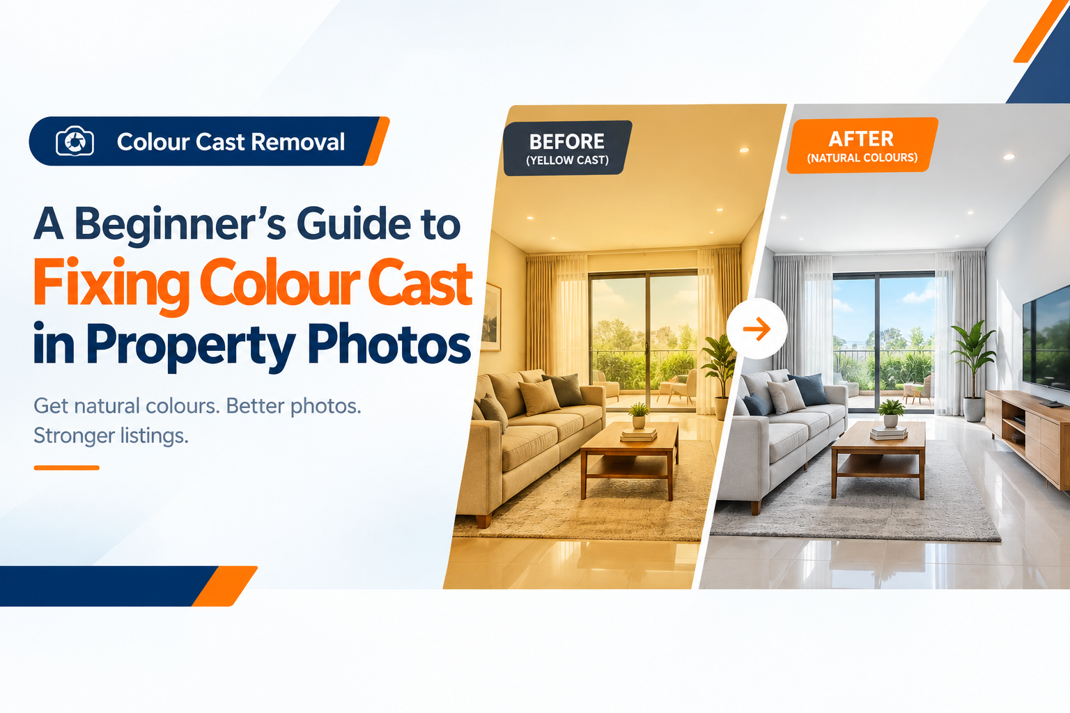
Have you ever looked at a property photo and noticed that the entire room looks too yellow, orange, blue, or green?
A white wall may appear cream-coloured. A kitchen may look unusually warm. A bedroom photographed under cool lighting may have a blue tint. Sometimes, the entire property listing can look inconsistent because every room has a different colour temperature.
This problem is known as a colour cast.
Colour cast is common in real estate photography because properties are photographed under many different lighting conditions. Indoor lighting, daylight from windows, LED bulbs, fluorescent lights, camera settings, and mixed light sources can all affect how colours appear in an image.
Fortunately, most colour casts can be corrected during photo post-production.
A basic white balance photo correction may be enough for a simple issue, while more complicated images may require professional colour correction, selective adjustments, masking, or full real estate colour grading.
The goal is not to make a property look artificially colourful. The goal is to restore natural-looking, realistic property colours so that walls, floors, furniture, fixtures, windows, and other features are represented accurately.
This beginner-friendly guide explains what colour cast means, why it happens, how professionals correct it, and when a color cast removal service may be useful for property listing photos.
1. What Is Colour Cast?
A colour cast is an unwanted colour tint that changes the way an image appears.
For example, a room with white walls should normally show those walls as white or close to white. If the entire room has a strong yellow tint, the walls may appear cream or beige.
Similarly:
- A yellow cast can make interiors look warm and aged.
- An orange cast can make wooden and neutral surfaces look excessively warm.
- A blue cast can make rooms appear cold.
- A green cast can make neutral surfaces look slightly green or muddy.
Colour cast does not necessarily mean the original photograph is bad. It often happens because cameras interpret different light sources differently.
For real estate photography, this matters because buyers rely heavily on listing images to understand the appearance of a property.
2. How Does Colour Cast Appear in Property Photos?
Colour cast can affect almost every part of a property image.
You may notice:
- White walls appearing yellow
- Ceilings looking blue
- Grey flooring appearing green
- Kitchen cabinets appearing too orange
- Furniture appearing warmer or cooler than it really is
- Neutral walls losing their natural appearance
- Outdoor images appearing excessively cool
- Different rooms having completely different colour temperatures
The problem can be particularly noticeable when several property photos are displayed together.
One room may look warm and inviting while another appears cold and blue. Even if both photographs were taken correctly, inconsistent colour can make the listing feel less polished.
This is why consistent image editing is important for property marketing.
3. What Causes Colour Cast in Real Estate Photography?
Several factors can create unwanted colour.
Indoor Lighting
Artificial lights can significantly influence colour.
Common examples include:
- Tungsten bulbs
- Fluorescent lighting
- Warm LED bulbs
- Cool LED bulbs
- Decorative lighting
Natural Daylight
Sunlight changes throughout the day. Morning, midday, evening, shade, and direct sunlight can all produce different colour characteristics.
Incorrect White Balance
If the camera's white balance does not match the lighting environment, neutral surfaces may develop a visible tint.
Mixed Lighting
A room may contain daylight from windows combined with warm ceiling lights and cooler LED fixtures.
This is one of the more difficult situations to correct because different areas of the same image may require different adjustments.
Camera Settings
Exposure, white balance settings, RAW processing, and other camera choices can influence the final appearance.
4. Yellow and Orange Colour Casts from Warm Lighting
Yellow and orange casts are particularly common in interior property photography.
Warm artificial lighting can make:
- White walls appear yellow
- Kitchens look orange
- Ceilings appear cream
- Grey surfaces look brownish
- Neutral furniture appear warmer than it actually is
This does not necessarily mean the property itself has these colours.
A professional editor can analyse neutral areas and adjust the colour temperature and tint to produce a more balanced result.
However, correction should not remove all warmth from an image. A room illuminated by warm decorative lights may naturally contain some warm tones.
The objective is balance, not complete neutralisation.
5. Green Colour Casts from Fluorescent Lighting
Fluorescent lighting can introduce a greenish tint into property photographs.
This may be visible on:
- White walls
- Ceilings
- Kitchen surfaces
- Office interiors
- Bathrooms
- Commercial properties
Green casts can sometimes be subtle, making them difficult to notice until the image is compared with a properly balanced photograph.
Tint correction can help neutralise unwanted green or magenta tendencies while preserving the property's genuine colours.
6. Blue and Cool Colour Casts
Blue or cool colour casts can appear when photographs are captured under cooler lighting conditions.
Possible causes include:
- Shade
- Overcast daylight
- Cool LED lighting
- Incorrect white balance
- Certain camera settings
A blue cast can make a room feel colder than it actually is.
Professional correction can adjust colour temperature while also considering exposure, highlights, shadows, and the surrounding environment.
Simply adding warmth is not always the right solution. Over-correcting a blue image can create an artificial yellow or orange appearance.
7. Why Mixed Lighting Creates Difficult Colour Problems
Mixed lighting is one of the biggest challenges in real estate colour correction.
Imagine an interior room with:
- Sunlight entering through a large window
- Warm ceiling lights
- Cool LED fixtures
- Reflections from coloured furniture
Different parts of the image may have different colour characteristics.
A single global white balance adjustment may improve one area while making another area worse.
This is where masking and selective colour correction become useful.
An editor may need to work on individual areas of the image rather than applying one adjustment across the entire photograph.
The result should still look like one naturally lit room rather than a collection of separately edited sections.
8. What Is White Balance Correction?
White balance correction is one of the first steps in fixing colour problems.
The purpose of white balance is to make neutral objects appear neutral under the lighting conditions in which they were photographed.
In a property photo, useful reference areas can include:
- White walls
- White ceilings
- Neutral countertops
- Grey flooring
- White cabinets
An editor can use these references to determine whether the image is too warm, too cool, too green, or too magenta.
However, white balance correction is only one part of a complete colour workflow.
A complicated image may require additional colour and tonal adjustments.
9. Colour Temperature and Tint Explained
Two important controls in colour correction are temperature and tint.
Colour Temperature
Temperature generally controls the warm-to-cool relationship.
Moving toward warmer tones can reduce excessive blue, while moving toward cooler tones can reduce excessive yellow or orange.
Tint
Tint helps correct the green-to-magenta relationship.
This is particularly useful when fluorescent or mixed lighting introduces a green or magenta bias.
For example:
Too yellow → adjust temperature
Too blue → adjust temperature
Too green → adjust tint
In real editing, the process is more nuanced because colour, exposure, saturation, and lighting all interact.
10. Exposure and Tonal Correction
Colour correction should not be performed independently from exposure.
A photograph that is too dark may appear muddy even after the colour cast is removed.
Similarly, excessive highlights can make bright walls and windows lose useful detail.
Editors may adjust:
- Exposure
- Highlights
- Shadows
- Whites
- Blacks
- Contrast
- Curves
- Levels
The objective is to create a balanced image where the property remains clear without making it look artificially bright.
11. Hue, Saturation and Vibrance Adjustments
After correcting white balance and exposure, colour may need additional refinement.
Hue
Hue changes the actual colour direction.
For example, a particular green may be shifted slightly toward a more natural green.
Saturation
Saturation controls colour intensity.
Too much saturation can make:
- Green grass look unnatural
- Blue skies look exaggerated
- Wooden surfaces look orange
- Furniture colours appear unrealistic
Vibrance
Vibrance generally provides a more controlled way to enhance weaker colours without aggressively increasing every colour.
For real estate photography, restraint is important.
The aim is not to create an advertisement with exaggerated colours. The aim is to create natural, attractive and believable listing photos.
12. Selective Colour Correction
Sometimes the entire image does not need the same correction.
Selective adjustments can target specific colours or areas.
For example, an editor may adjust:
- Green grass
- Blue sky
- Yellow walls
- Orange wood
- Grey flooring
- White surfaces
Masking can also be used to isolate areas such as:
- Windows
- Walls
- Cabinets
- Ceilings
- Furniture
- Exterior landscaping
This allows the editor to correct specific problems while protecting colours that are already accurate.
13. RAW and HDR Property Photography
The original file format can affect how much flexibility an editor has.
RAW Photography
RAW files preserve substantial image information from the camera and usually provide greater flexibility for adjusting:
- White balance
- Exposure
- Highlights
- Shadows
- Colour
- Tonal range
HDR Photography
HDR workflows combine multiple exposures to improve the visible range of tones in difficult lighting conditions.
However, HDR does not automatically guarantee good colour.
An HDR image can still have:
- Yellow interiors
- Blue windows
- Green casts
- Excessive saturation
- Unnatural contrast
Colour correction is therefore still important during property photo post-production.
14. Lightroom and Photoshop Colour Correction
Professional editors may use tools such as Adobe Lightroom, Adobe Camera Raw and Adobe Photoshop depending on the image and required result.
A typical workflow may include:
Import and review the original image
Identify the colour cast
Correct white balance
Adjust temperature and tint
Balance exposure
Recover highlights and shadows
Refine hue and saturation
Apply selective colour adjustments
Use masks where necessary
Compare against the original
Check consistency with other listing images
Export the final image
The software is only part of the process.
Understanding lighting, materials, colour relationships, and property photography is equally important.
15. AI-Assisted Colour Correction
AI-assisted editing can help speed up repetitive colour correction tasks.
AI tools may assist with:
- Automatic white balance
- Exposure analysis
- Colour enhancement
- Scene recognition
- Batch processing
- Mask generation
However, automatic correction is not always perfect.
An AI system may interpret a warm interior as a colour problem when the warmth is actually intentional.
It may also struggle with mixed lighting or unusual materials.
A practical professional workflow can therefore combine:
AI-assisted correction → professional refinement → human quality control
This approach can improve efficiency while maintaining control over the final appearance.
16. Colour Correction vs Colour Grading
These terms are sometimes used interchangeably, but they have different purposes.
Colour Correction
Colour correction focuses on fixing problems.
Examples:
- Removing yellow tint
- Correcting blue cast
- Fixing green tint
- Balancing white balance
- Restoring neutral colours
Colour Grading
Colour grading is more creative.
It can influence the overall visual mood and colour character of a series of images.
For property listings, correction is usually more important than dramatic grading.
A luxury property may benefit from a polished visual style, but its actual materials and colours should remain believable.
The right real estate color grading service should therefore prioritise consistency and realistic representation rather than excessive stylistic effects.
17. How to Maintain Consistent Colour Across a Listing
A professional listing should feel visually consistent from one photograph to another.
Imagine viewing:
- Living room
- Kitchen
- Bedroom
- Bathroom
- Exterior
- Garden
- Aerial photograph
If every image has a different colour temperature, the listing can feel disconnected.
A consistent workflow can help maintain:
- Similar white balance
- Consistent exposure
- Controlled saturation
- Natural skin and material tones where applicable
- Consistent contrast
- Similar visual warmth
This is especially important for agencies and photographers processing large batches of property photos.
A professional photo color correction service can help establish consistent editing across an image set rather than treating every photograph as an unrelated file.
18. DIY Editing vs Professional Colour Correction
For a simple image, DIY correction may be sufficient.
For example, if a photograph has a mild yellow tint, adjusting white balance may solve most of the problem.
Professional editing becomes more useful when:
- The colour cast is strong
- Lighting is mixed
- Multiple rooms need matching
- Images were photographed under different conditions
- White surfaces are difficult to balance
- Windows and interiors have different colour temperatures
- Large batches require consistent treatment
- The listing has a tight deadline
- The images require additional retouching
DIY Correction
Professional Correction
Good for simple colour problems
Suitable for complex colour problems
Usually manual per image
Can support batch workflows
Basic white balance
Advanced colour correction
Limited consistency across batches
Consistent editing standards
Suitable for small quantities
Useful for agencies and photographers
Requires learning editing tools
Editing handled by specialists
The right choice depends on the image complexity, volume, deadline and desired quality.
19. How to Prepare Photos for a Colour Correction Service
If you plan to hire a professional editor, provide the highest-quality original files available.
Useful information includes:
- Original RAW files when available
- High-resolution JPEG files
- Complete property image sets
- Reference images if you have them
- Preferred output format
- Required dimensions
- Listing platform requirements
- Desired delivery deadline
- Any specific colour concerns
You can also identify particular problems.
For example:
“The living room looks too yellow.”
or:
“The kitchen walls should appear neutral.”
Clear instructions help the editor understand the problem without unnecessarily changing other aspects of the image.
20. How to Review Corrected Property Photos
Before publishing the final images, compare the edited version with the original.
Check:
White Surfaces
Do walls, ceilings and cabinets look reasonably neutral?
Furniture
Do furniture colours still look believable?
Flooring
Does the floor retain its natural material and colour?
Windows
Does the corrected interior still look realistic around the windows?
Exterior
Do grass, trees, walls and building materials look natural?
Saturation
Are colours attractive without looking exaggerated?
Consistency
Do all images from the same property have a similar visual appearance?
Accuracy
Does the final image still represent the actual property?
This final review is particularly important because colour correction should improve presentation without changing reality.
When Should You Use Professional Colour Correction?
Professional editing is particularly useful when property images need more than a basic white balance adjustment.
Consider professional help when:
- You have many listing photos
- Images contain mixed lighting
- Several rooms have different colour casts
- The property needs consistent presentation
- DIY editing produces unnatural results
- You need fast turnaround
- You manage recurring listings
- You want a repeatable post-production workflow
For agencies, developers, photographers and property marketing teams, outsourcing can also reduce the time spent manually correcting every image.
FAQs
What is colour cast in real estate photography?
Colour cast is an unwanted tint that affects the overall appearance of a property photograph. Common examples include yellow, orange, blue and green casts.
Why do property photos look yellow?
Property photos often look yellow because of warm indoor lighting, tungsten bulbs, warm LEDs, incorrect white balance or mixed lighting.
How do I fix a yellow or orange colour cast?
Start by correcting white balance and colour temperature. Depending on the image, you may also need tint, exposure, saturation and selective colour adjustments.
Why do some property photos look blue?
A blue appearance can result from cool lighting, shade, daylight conditions or incorrect camera white balance.
What causes a green colour cast?
Fluorescent lighting is a common cause of green colour casts. Mixed lighting and camera processing can also contribute.
Is white balance correction the same as colour cast removal?
Not always. White balance correction is one method of addressing colour problems. More complicated colour cast removal may require additional tint, hue, saturation, masking and selective adjustments.
What is the difference between colour correction and colour grading?
Colour correction fixes unwanted colour and tonal problems. Colour grading focuses more on creating a consistent visual style or mood.
Can AI remove colour casts automatically?
AI-assisted tools can help identify and correct colour issues, but results may vary. Mixed lighting and unusual materials can still require professional review.
Should real estate photos be highly saturated?
Generally, no. Excessive saturation can make property images look artificial. Natural and believable colour is usually more appropriate for property marketing.
Can colour correction make an old property look newer?
Colour correction can improve the presentation of an image, but it should not misrepresent the property's actual condition. Editing should improve colour and clarity rather than conceal genuine property characteristics.
How much does real estate photo colour correction cost?
Pricing can depend on image complexity, volume, original file quality, required corrections, turnaround time and whether the work involves basic correction or more advanced grading. For bulk property photo colour correction, providers may offer different packages based on the workflow.
Is professional colour correction worth it for property listings?
It can be worthwhile when you need consistent, natural-looking images, particularly for multiple rooms, large image batches, mixed lighting or recurring property listings.
Conclusion
Colour cast is one of the most common problems encountered in property photography, but it is also one of the problems that can often be corrected effectively during post-production.
The key is understanding what caused the unwanted colour before trying to remove it.
A practical correction workflow is:
Identify the unwanted colour → determine the lighting cause → correct white balance → adjust temperature and tint → balance exposure → refine saturation and vibrance → check individual colours → compare with the original → perform final quality control.
For simple photographs, a basic white balance adjustment may be enough. More complicated interiors, mixed lighting and large property image sets may require selective correction, masking, professional colour grading and human quality control.
Most importantly, colour correction should not make a property look completely different from reality. It should help viewers see the property more naturally and consistently.
For real estate agents, photographers, sellers, developers and property marketing teams, a reliable editing workflow can make listing images easier to review, publish and present professionally.
Restore Natural Property Colours with Professional Color Correction from Voxelhaus Consultancy
If your property photos look too yellow, orange, blue, green, muddy or inconsistent, Voxelhaus Consultancy can help with professional colour correction and colour cast removal.
A professional workflow can include:
- Natural-looking colour correction
- Accurate white balance adjustment
- Realistic property colour restoration
- Interior and exterior photo correction
- Colour temperature and tint correction
- Exposure and tonal balancing
- Selective colour adjustments
- Consistent editing across image sets
- AI-assisted editing where appropriate
- Human quality control
- Listing-ready image delivery
Whether you are preparing your first property listing or managing recurring real estate photography requirements, professional colour correction can help create a more consistent and polished presentation while keeping the property visually accurate.
Send your property photos to Voxelhaus Consultancy and get them professionally reviewed for colour cast, white balance and overall colour consistency.